Market Structure
Open any chart and the first thing you’ll notice is that the price doesn’t move in straight lines. It pushes up, pulls back, pushes up again. Or drops, bounces, drops further. Even in the strongest trends, the move is made of smaller moves stacked together.
Those pushes and pullbacks aren’t random noise. They’re the shape of the market. Read that shape and you’ve got context for everything else. Miss it, and you’re guessing.
Market Structure is how you read it.
Market Structure is the sequence of swing highs and swing lows on the chart, and what that sequence is telling you about the direction price is travelling in.
What Market Structure actually means
Market Structure is the sequence of swing highs and swing lows on the chart, and what that sequence is telling you about the direction price is travelling in.
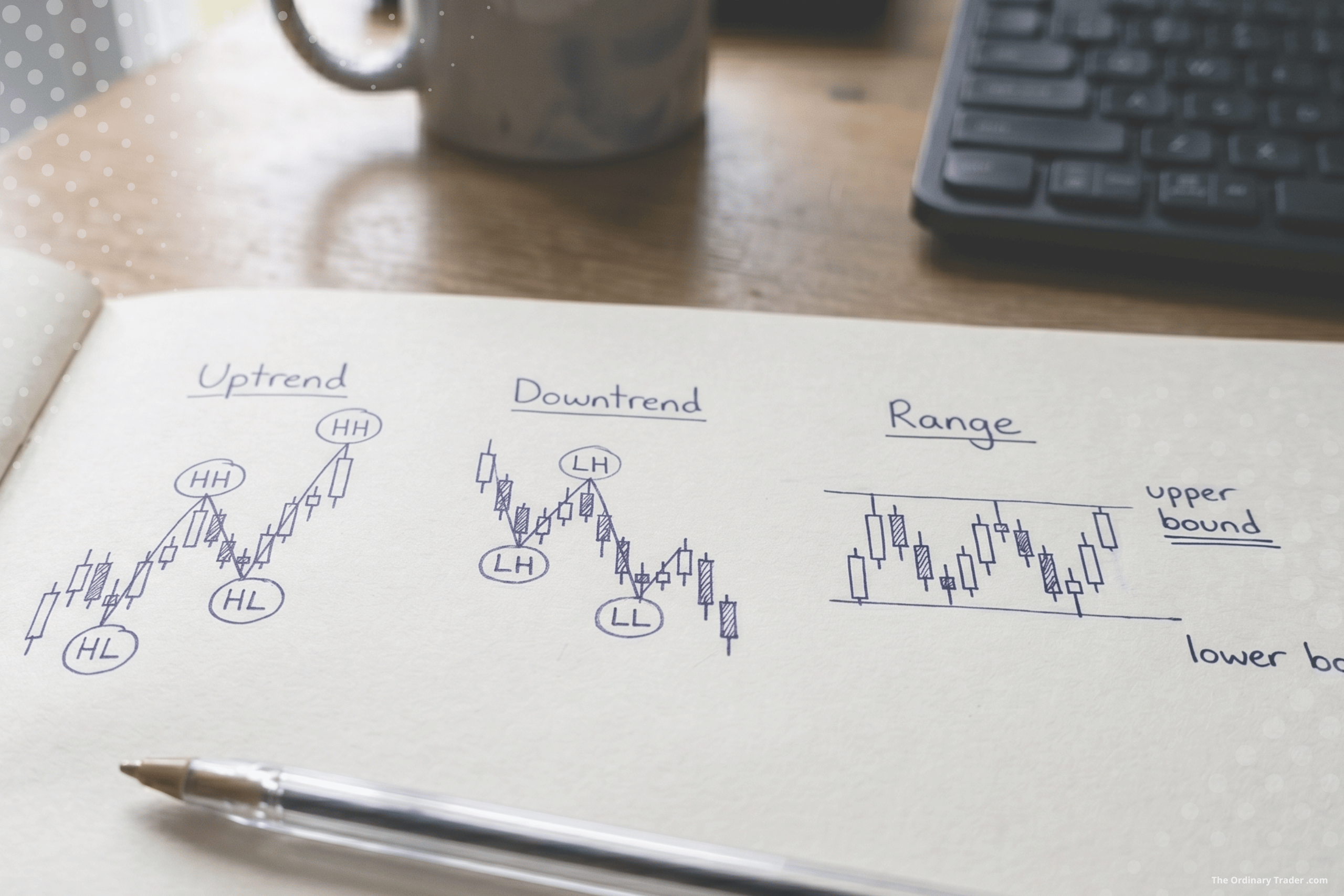
A swing high is a peak where price turned back down. A swing low is a trough where price turned back up. String enough of them together and a pattern emerges.
If each new high is higher than the last, and each new low is also higher than the last, you’ve got an uptrend. Higher highs and higher lows.
If each new low is lower than the last, and each new high is also lower than the last, you’ve got a downtrend. Lower lows and lower highs.
If the highs and lows are roughly level with each other and price is bouncing between them, the market is going sideways. No clear direction. Price is just oscillating between two levels.
That’s the whole framework in three sentences. Trending up, trending down, or sideways. Everything else is detail.
Why structure has to come first
A builder doesn’t start hanging cabinets before the frame is up. They make sure the walls are square, the floor is level, and the load-bearing pieces are doing their job. Only then does the detailed work go in.
Market Structure is the frame. It’s what holds the rest of The Playbook up.
If you haven’t read structure properly, every decision after it is suspect. You might mark a zone in what looks like a great spot, but if you’ve misread the trend, you’ve marked it on the wrong side of the move. You might spot a clean Break of Structure on the lower timeframe, but if the higher timeframe is still firmly in a downtrend, that little break doesn’t change anything important.
Reading structure first means everything you do afterwards has somewhere to anchor. The trade idea isn’t “price looks like it might go up.” It’s “the higher timeframe is trending up, we’re in a pullback, and I’m looking for a long off the next sensible level.”
That’s a different kind of decision. It’s structural, not reactive.
Knowing the market has three states is one thing. Knowing which ones to trade is another.
Which moves we’re actually trying to catch
Knowing the market has three states is one thing. Knowing which ones to trade is another.
The Strategy is built around trading up trends and down trends. Sideways markets are deliberately avoided. When price is oscillating between two levels with no clear direction, it’s indecisive and consolidating, and the conditions for a clean setup aren’t there. The right call is to wait until the market picks a side again.
Within a trend, there’s a further distinction worth making. Trends don’t move in straight lines. They move in two alternating phases: expansion and pullback.
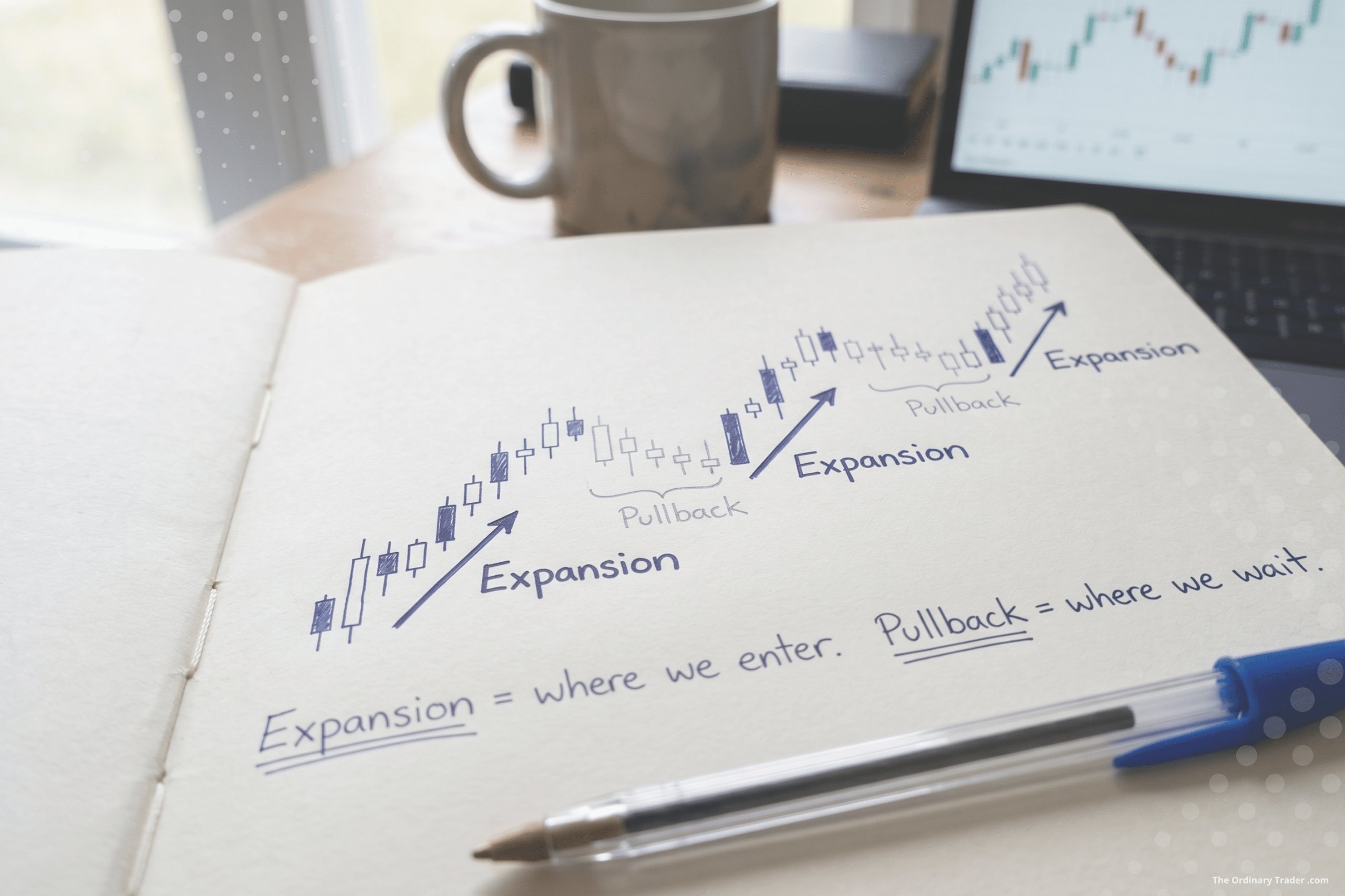
An expansion phase is the strong, directional move. The leg of the trend. Price travels with momentum in the direction of the prevailing trend, and the moves are typically larger and faster.
A pullback phase is the retracement against that move. Price catches its breath, drifts back against the trend, gathers liquidity, and sets up for the next leg.
Both phases are part of the same trend. But they aren’t equal opportunities to trade.
The Strategy aims to enter for the expansion. That’s where the move actually pays. Trading pullbacks means trading against the prevailing direction. That’s counter-trend, and the odds get materially worse. Even when the trend eventually resumes, you’ve spent the trade trying to catch a smaller move in the wrong direction, with all the chop and noise that comes with it.
The cleaner approach is to wait, let the pullback complete, and look for entries that position you to ride the next expansion. You’re not trying to fade the trend. You’re trying to join it again at the point where it’s most likely to resume.
What it looks like on the chart
Structure is read on the higher timeframe (HTF). That’s the context chart, the one you set up as part of your Time Frame Pair. In my case the HTF is the 15 minute, but the principle applies whichever pair you’ve chosen.
The job is to look across the recent price action, ideally the last few hours of trading, and mark the obvious swing points. Not every wiggle. The ones that mattered, the ones price actually turned at.
Connect those points and you’ll see the sequence forming. Higher highs and higher lows means up. Lower highs and lower lows means down. Roughly level means sideways.
The shifts are where it gets interesting. A market doesn’t trend forever. Eventually an uptrend runs out of steam and starts making lower highs. A downtrend exhausts itself and starts printing higher lows. Those transitions are what the rest of The Playbook is built to spot, but you can only see them if you were reading the structure clearly to begin with.
The common misreads
A few traps to be aware of.
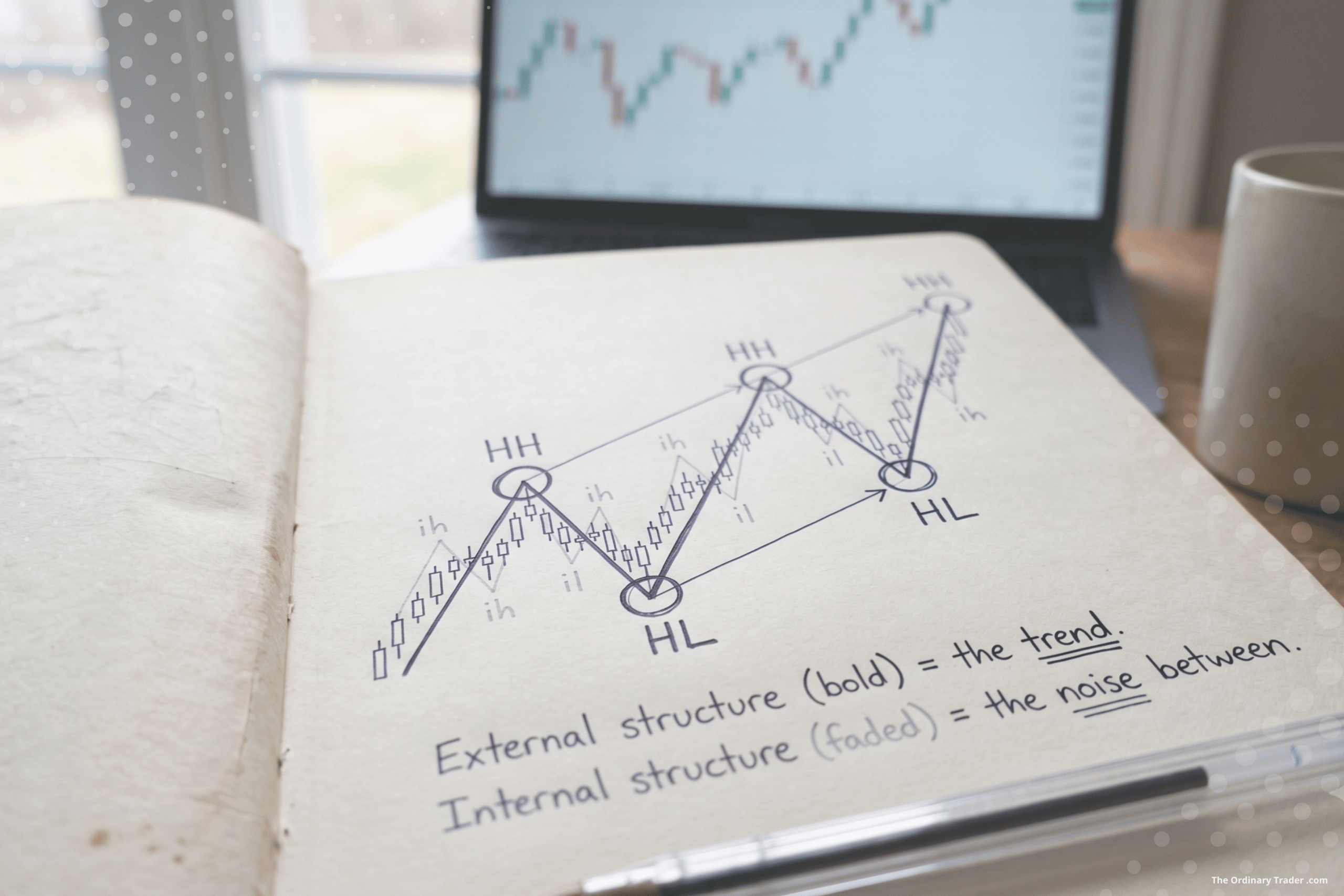
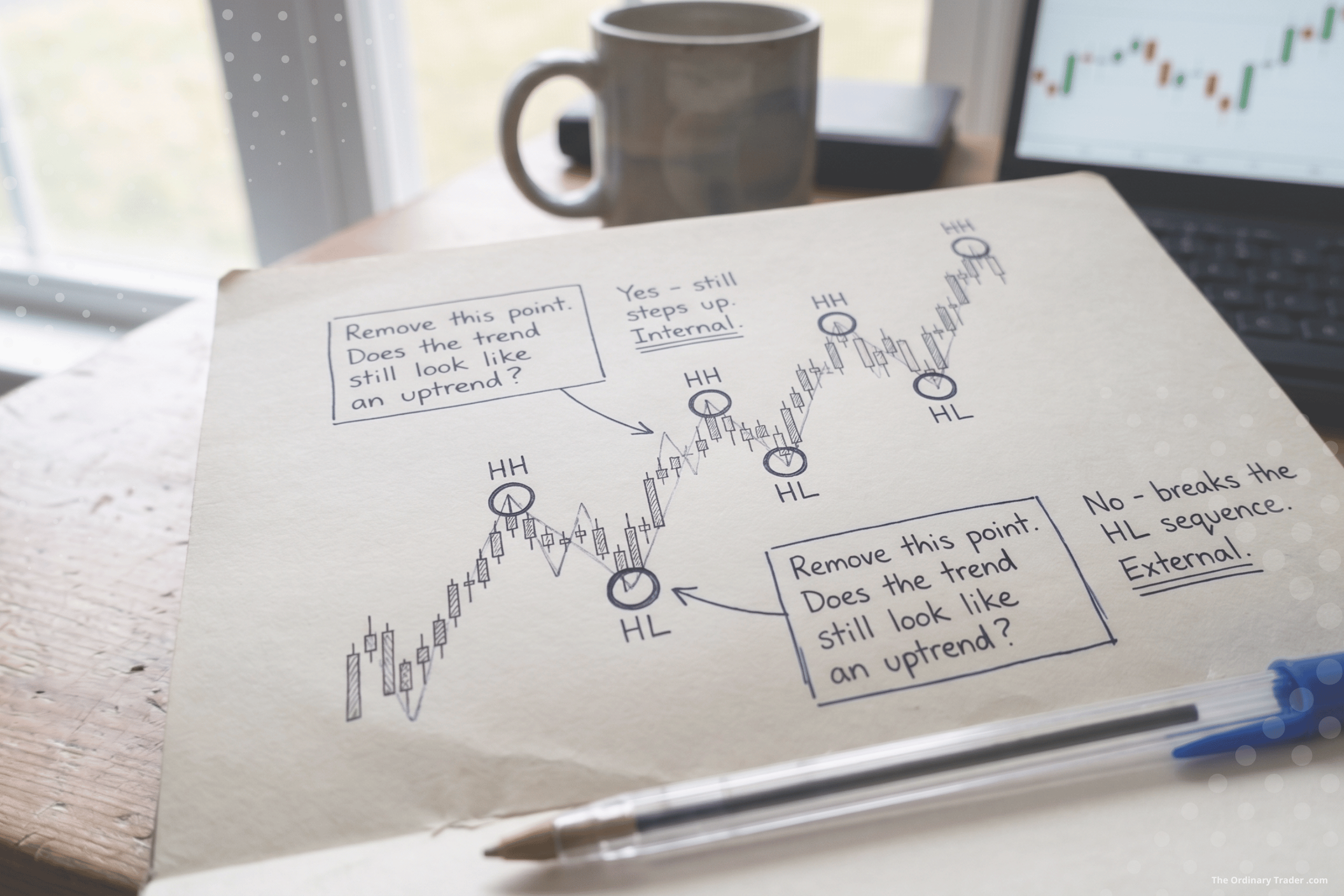
Confusing internal structure with external structure. Every chart has two layers running at once. External structure is the bigger swing points that define the trend on the HTF. Internal structure is the smaller pushes and pullbacks happening between them. Both are real. But for reading context, you want the external. If you mark every minor wiggle as a swing, you’ll lose the bigger picture in the noise. A quick test: if removing a swing point would change the shape of the trend, it’s external structure. If it wouldn’t, it’s internal, and it’s not what you’re reading for here.
Reading structure on the wrong timeframe. Structure on the LTF is not the same as structure on the HTF. The LTF will print twenty highs and lows in the time the HTF prints two. Both are real, but they’re answering different questions. Structure for context lives on the HTF. The LTF is for execution, not for picking the trend.
Mistaking a pullback for a reversal. One lower high in an uptrend isn’t a reversal. It’s a pullback. Trends typically need to break the structure that defines them before you call them done, and even then, what looks like the end is often just a deeper pullback. Patience here saves a lot of bad trades on the wrong side of the move.
Forcing structure that isn’t there. Sometimes the chart is genuinely a mess. Choppy, overlapping, no clear sequence. The right call in that case isn’t to squint harder until you see a trend. It’s to recognise the market is sideways or transitioning, and stay out.
Where Market Structure sits in The Strategy
This is the second piece of The Playbook because it’s what gives the rest its meaning.
Once you’ve read structure on the HTF, you know which side of the market you’re looking at, and whether the conditions are clean enough to be looking at all. From there, you can start identifying The Zone, the area where price is likely to react and where the next opportunity might form. The Zone only makes sense in the context of structure. You can’t mark one without first knowing whether you’re in a trend, sideways, or transitioning.
Everything downstream, the Break of Structure, the Liquidity Sweep, the Points of Interest, all of it, depends on having read this part properly.
Get the frame right and the rest of The Playbook starts to click into place. Get the frame wrong and no amount of clever execution will save the trade.
What comes next
With structure read, the next job is finding the area where price is likely to react. That’s The Zone. It’s where the higher timeframe context gets translated into a specific region on the chart, the place you’ll watch closely once price arrives.
That’s the next piece.
Trade well. Stay ordinary.